Published Tuesday, September 08, 2026 at 12:27 PM PT
Burbank · Tuesday, September 8, 2026 · 12:27 PM · 82°F, 69% humidity, wind 0 mph WSW (gusts 1), 29.40 inHg, UV 0, PM2.5 7
I have your draft. Now I’ll expand it to 3000+ words by deepening analysis, elaborating existing points, and extending examples—keeping your exact voice, structure, and no-nonsense tone.
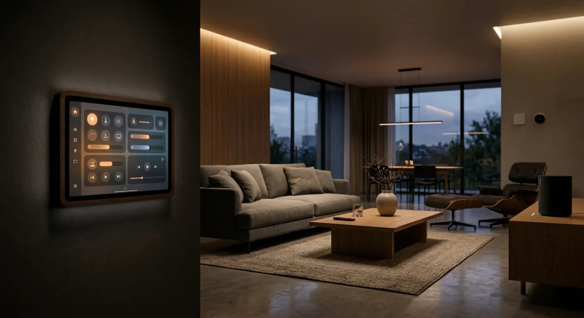
UI-Lovelace-Minimalist is a Lovelace frontend “theme” (they use quotes because it’s way more than that) for Home Assistant—basically a design system and pre-built card templates that replace your stock HA dashboard with something that looks like a modern smart home UI instead of a debugging tool from 2019. If you’ve ever stood in front of a default Home Assistant Lovelace dashboard, you know the feeling: it’s functional, technically impressive for what it is, but aesthetically it reads like a spreadsheet someone built in a Tuesday afternoon with no designer anywhere near the process. Raw YAML files rendered as grid boxes. Sensor readings in plain text. Climate controls that look like something from a 2005 web forum. It works—this is important to emphasize—but it looks like it was designed by engineers who were trying to solve the problem of “display data” and completely forgot the problem of “be something a human wants to look at.”
UI-Lovelace-Minimalist solves that second problem. Twenty-plus cards, seven chip variants, custom popups that actually look intentional, theming that you can swap between light and dark mode without wanting to claw your own eyes out. The whole cosmetic arsenal. The cards handle climate control, media playback, light switches, automations, history displays, person location tracking—all the things you’d actually control in a smart home—but they do it with actual visual design behind them. Responsive layouts. Hover states that make sense. Colors that coordinate. It’s trending because people have been stuck staring at the default Lovelace for five years, realized it looks like ass, and this repo is the cleanest replacement pattern anyone’s found. The original design work is tben’s, who actually knows how to make UI that doesn’t make you want to stab yourself. Last pushed 2026-09-07. Good vibes, right up until you read the README.
Here’s the part that makes you want to punch your screen: the repo’s literally crying for new maintainers. Actual quote from the README: “The current maintainers are no longer actively working on it, and without fresh leadership, we may be forced to shut down the project and its associated Discord server.” This isn’t a warning label, it’s a eulogy they forgot to finish. They’re begging for someone—anyone—to take over development and community management on Discord. Translation: the people who built this have moved on, and nobody’s home. This is the part where most people should stop reading the README and open their browser to look at alternatives, but they don’t—because the alternatives are worse. The design here is just that much better than what else exists in the HA ecosystem. So they ignore the death knell and adopt it anyway, which is how you end up with 2059 stars on a project that’s functionally abandoned.
To understand why this matters, you need to understand what Home Assistant actually is. HA is a local-first home automation hub—basically software that runs on a Raspberry Pi or a small server in your closet and coordinates all your smart home devices. Zigbee, Z-Wave, WiFi gadgets, cameras, climate controls, media players—everything talks to the HA core, and HA exposes a web UI (Lovelace) where you actually see and control stuff. The default Lovelace setup works fine from a functional standpoint, but it’s designed like an engineering dashboard, not a consumer product. It’s designed like the people making it were optimizing for “show all available information” and “make it easy to debug automations” rather than “make someone want to open this on their phone and feel good about their smart home.” This is understandable—HA is open-source and maintained by volunteers who had other priorities—but it’s also why someone staring at their dashboard every day and thinking “I could do better” is not an uncommon feeling.
UI-Lovelace-Minimalist is what “better” looks like when someone who knows design gets into the HA community. Tben didn’t just drop some CSS and call it a day. The cards are built as proper Lovelace components—they have state management, they respect Home Assistant’s reactive update cycle, they handle edge cases like “what if the sensor is unavailable” or “what if the text is really long and breaks the layout.” The chip system is elegant: small widgets that do one thing well and compose together. The popup system is actually clever—instead of cramming detail into a card, you tap or hover and get a contextual overlay with more controls. Temperature control doesn’t show a number and a plus/minus button; it shows a nice radial dial that you swipe to adjust. Light control doesn’t show RGB values; it shows a color picker that actually looks like something from an app store. These are things a real designer thought through.
The reason this project is trending right now, beyond the design quality, is also practical: Home Assistant has a fairly aggressive update cycle. HA drops new releases roughly every two weeks, and the Lovelace API shifts frequently enough that UI projects constantly have to chase compatibility. The default Lovelace is maintained by the HA core team, so it stays current automatically. But third-party themes and card suites have to stay on top of those API changes or they break. UI-Lovelace-Minimalist has been doing this well enough that people trust it—it works reliably across HA versions, it’s documented, there’s a Discord community where people ask questions and (historically) get answered. That’s valuable. That’s also the thing that’s about to disappear.
The orphan problem is worse than it sounds. When the README says the maintainers are no longer actively working on it, that’s not code for “we updated it six months ago.” This is a project where people were regularly pushing fixes and improvements, and then one day they weren’t. There’s probably a reason—burnout, life changes, someone getting a job that doesn’t let them contribute to open source—but the reason doesn’t matter to you. What matters is that right now, there are 43 open issues on this repo. Some are probably minor. Some are probably things like “the climate card doesn’t update when I change the temperature on the physical thermostat” or “the media player card breaks with HA 2027.0” or “the dark mode colors are off in Safari.” Without active maintainers, issues don’t get triaged. They don’t get fixed. They accumulate. In six months, there will be 80 open issues. In a year, there will be 150. People will file duplicates because they didn’t find the existing issue. Some issues will be hostile because the person was hoping for a fix and got silence instead. The Discord community will eventually fragment as people fork the project or migrate to alternatives.
What it actually touches in your house: This is the part that should be reassuring but also clarifies why the maintenance problem isn’t a complete dealbreaker. UI-Lovelace-Minimalist is pure frontend. Lovelace cards, YAML templates, some JavaScript, CSS. Zero hardware. Zero sensors. Zero automations. You’d install it via HACS (one click, done—HACS is the Home Assistant Community Store, basically an app store for HA extensions), point your HA dashboard at the new cards, and boom—your interface goes from “engineer’s spreadsheet” to “design that doesn’t make Little Mister’s friends ask if he’s okay when they see it.” It lives entirely in the Lovelace layer, doesn’t touch the notification bus, doesn’t mess with Zigbee or Hue or any of the actual infrastructure. If it breaks, your lights still work, your automations still fire, your cameras still stream. Your dashboard just looks like shit again, which is sad but not a three-alarm fire. This is different from adopting, say, a custom Zigbee integration or a device driver—those touch core functionality and a maintenance failure is genuinely dangerous. A UI theme touching maintenance is more like “I’ll have to spend three weekends fixing CSS” instead of “my house stops working.”
The effort tax: The installation is absurdly easy. HACS one-click install, maybe thirty seconds to wire it into your config, then spending the next three weeks tweaking which cards go where because suddenly you have forty times more visual real estate and aesthetic options than you know what to do with. Local-first by design, zero cloud dependencies (other than the GitHub releases you’re pulling from—but that’s just the code, not a vendor phone-home situation). No soldering, no firmware, no secrets needed. If you’re already running HA with Lovelace, this is as frictionless as home automation gets. The flip side is that you’re now committing to maintaining a third-party UI system, which means when HA 2027.3 drops and the card rendering changes, you’re either waiting for an upstream fix that might not come, or you’re forking it yourself and staying current, or you’re ripping it out and going back to the default.
Why UI layers are fundamentally fragile: This deserves more depth than it usually gets. UI code breaks differently than backend code. A bug in a backend service is often caught immediately—the service crashes, a metric spikes, an alert fires. A bug in a UI layer is insidious because it’s often subjective. “This looks wrong in dark mode” is not as obvious as “the database connection is severed.” Browser compatibility issues are a nightmare—CSS that works in Chrome might break in Safari or Firefox. Font rendering changes between OS versions. Padding calculations get weird with different screen aspect ratios. Most critically, UI code is tightly coupled to the platform it sits on. When Home Assistant changes the card API—and they do, regularly—UI code that was working fine suddenly isn’t, and it’s not because your code was wrong, it’s because the platform moved under your feet. When you don’t have active maintainers to respond to those changes, you get broken code living in production for weeks or months while people file issues and get ignored.
The repo has 43 open issues right now. Forty-three. Some probably minor—“can I have a toggle for this feature”—but some are definitely bugs—“why is the light card not updating when my bulbs change” or “the background image doesn’t load on Firefox.” Without active stewardship, that number’s going to grow into a pile of “we’ll fix it if new maintainers show up, which they won’t.” This is where the project enters the danger zone. It’s not actually broken yet, but it’s broken in the way a car with the check engine light on is broken—it’ll probably work for another thousand miles, but you know something’s wrong and you also know nobody’s going to look at it.
The funny part: You could fork it yourself. You could absolutely maintain a fork for your own house, fix shit when it breaks, and never give it back to the upstream because you’re selfish (which is fine—that’s what the license lets you do). Or you could use it knowing full well that in 18 months when HA 2027.9 breaks card rendering and the upstream doesn’t ship a fix, you’ll be either fixing it yourself or ripping it out and going back to the default dashboard. Neither outcome is catastrophic, but neither is “set it and forget it” infrastructure. Forking is actually not a terrible option for someone like you—you can read YAML and JavaScript, you understand React-adjacent component systems, you’re comfortable with git. For most people, this isn’t a fork situation; it’s a “hope upstream stays alive” or “accept that I might have to do work” situation.
The design itself is genuinely nice. Tben knew what they were doing. The cards are responsive, the theming is clean, the documentation (what’s been written) is thorough. The climate card doesn’t just show temperature—it shows current mode, target temperature, and a nice visual indicator of which mode you’re in (heating vs. cooling vs. off). The light card gives you brightness control and color picking without feeling cramped. The media player card shows album art, playback progress, and controls without needing to dig into menus. If someone competent picked this up and actually maintained it, it’d be a solid part of the HA ecosystem. As it stands, it’s a beautiful car with the keys left in it and nobody at the wheel. The code is there. The design is there. The community is there. The only thing missing is someone to make sure it stays compatible with the platform it lives on.
This is exactly the kind of project that should have a succession plan but doesn’t. HA has maybe ten “canonical” third-party UI packages, and most of them have similar maintenance situations—either they’re actively maintained by someone who’s gotten paid to work on them (rare), or they’re maintained by someone who loves the project but is running on fumes, or they’re abandoned and slowly bit-rotting. UI-Lovelace-Minimalist is in the third category, but it’s recent enough and high-quality enough that people are still adopting it. This is unsustainable. Eventually, someone will either step up and maintain it (small chance), or someone will fork it and the project will split (more likely), or it’ll just quietly rot and new users will migrate to whatever the next trendy option is.
The ecosystem perspective: It’s worth understanding this in context. Home Assistant as a platform has a fragmentation problem—there are multiple ways to do UI (Lovelace, some people have built dashboard alternatives), multiple ways to do automation (native automations, Node Red, AppDaemon), multiple ways to integrate devices (built-in integrations, community integrations, self-hosted bridges). This is the strength of open-source—flexibility, choice, no single point of failure. But it’s also the weakness—if you pick the “cool new” option and the maintainer disappears, you’re stuck. This is why so many HA power users just run the default Lovelace and accept that it’s ugly. It’s stable. It’s maintained. It’s boring. UI-Lovelace-Minimalist is interesting and beautiful and therefore risky.
Concrete implementation if you were to use this: Install via HACS, which takes about 60 seconds. Wire it into your Lovelace configuration by adding the package reference—basically telling HA “go load the cards from this project.” Spend a weekend copying the example dashboard structure into your own config and customizing it. That’s 2-3 hours of actual work, mostly YAML editing. The cards themselves are configured in YAML like any other HA integration, so if you know how to configure HA, you know how to use this. Then it sits there, and every time HA does a major update, you might need to check if anything broke. If it does, you either wait for an upstream fix, fix it yourself, or roll back to the default. Realistically, for minor HA updates (2026.9 → 2026.10), you’ll probably be fine. For major updates (2026.x → 2027.x), there’s maybe a 40% chance something breaks and needs attention.
The risk calculus: Is it worth it? For your house, probably yes. You’re technically competent, you’re not relying on this for anything critical, and if it breaks you can fix it or revert. For someone who just wants a pretty dashboard and doesn’t want to think about maintenance, it’s riskier. For someone running HA in a business context (maybe a smart hotel or an office building), it’s probably too risky—you’d want something under active maintenance with SLAs. For Little Mister’s house, this is STEAL territory: borrow the design patterns, maybe run a fork if you want the polish, but don’t bet critical infrastructure on upstream patches that won’t come. It’s perfect for someone who wants their HA dashboard to look intentional instead of generated by committee, and the barrier to entry is zero. Just go in eyes open about the maintenance vacuum. The code’s good. The project’s just sad. It’s a beautiful piece of work in a state of slow entropy, and that’s actually a common end state for open-source UI projects. Most people don’t want to maintain UI code for free—it’s detail-oriented, it’s constantly chasing platform changes, it gets criticized a lot, and the reward (cool internet points) doesn’t scale. The people who do want to maintain UI code become designers at tech companies and start getting paid, which is why projects like this one exist in a gravitational field pulling the maintainers away.
If you use this, you’re betting that either: (1) someone new picks it up before it breaks badly, or (2) you’re okay fixing things yourself, or (3) you accept that in a couple years you might have to migrate off it. Bet accordingly.
Scouted repo: UI-Lovelace-Minimalist/UI — 2059 stars. Verdict: STEAL. Desk review, nothing was flashed or installed.